SaveUp: Millenial Money-Saving Made Magical
Alex Heidarian began Save Up around early 2017, and being quite receptive to my feedback, had asked me to collaborate with him on this project. A self-taught designer, he has credited me for accelerating the progress of this project faster than he expected to on his own. While Alex focused on product research and visual design — the latter of which I advised him on—, I took on the role of UX designer, and my focuses were mainly on interaction design, information architecture, and user testing.
TL;DR
To summarize the summary of the summary:
In a world with Venmo that makes spending easier for the millenial generation, we saw a need for a tool that helps millenials be monetarily responsible in a language that appeals to them. The SaveUp mobile app was made with the intent to keep 18-25-year-olds on task to save responsibly for the things they want by gamifying the process.
Role: UX Designer
Tools Used: Pen and paper, Sketch, InVision, Figma/p>
The Problem
Millenials have easy and addictive access to spending money on the things they want. How can we help them save for the things they want in a way that builds habits?
Process
We loosely based our process on the Google 5 Day Design Sprint process, following the steps of Map, Sketch, Decide, Prototype, Test. (Successfully cramming a 5 day sprint into one day, suffice it to say, would require a T.A.R.D.I.S.)
User Research
...or why it's hard to be your own client.
“ There are two pitfalls a UX Designer can fall into. Either they don’t empathize with the users at all--how is a 25 year old designer going to understand why the 70 year old lady with bad vision is going to want more explicit design patterns that are less elegant? The second--and possibly more pernicious of the two pitfalls-- is that the designer is the target demographic, and generalizes his or her experiences to the entire demographic. ” -Silicon Valley UX Design Meetup
Being in the target demographic, we avoided the second pitfall by doing outside research and talking to potential users about their pain points.
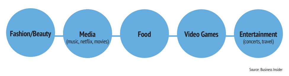
We researched what kinds of products our target demographic was spending their money on.
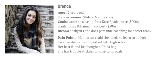
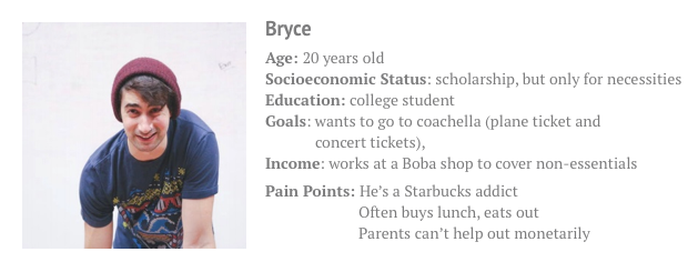
Meet the Brenda and Bryce.
Decisions, Decisions, Decisions
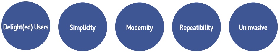
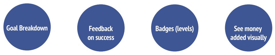
In order to best serve our users’ needs and values, we decided on key principles and features for our app.
Value Proposition
We will motivate our users to save money (not just record it).
Key Values
Important Features
Design Exploration
Because there's a difference between theory and practice...
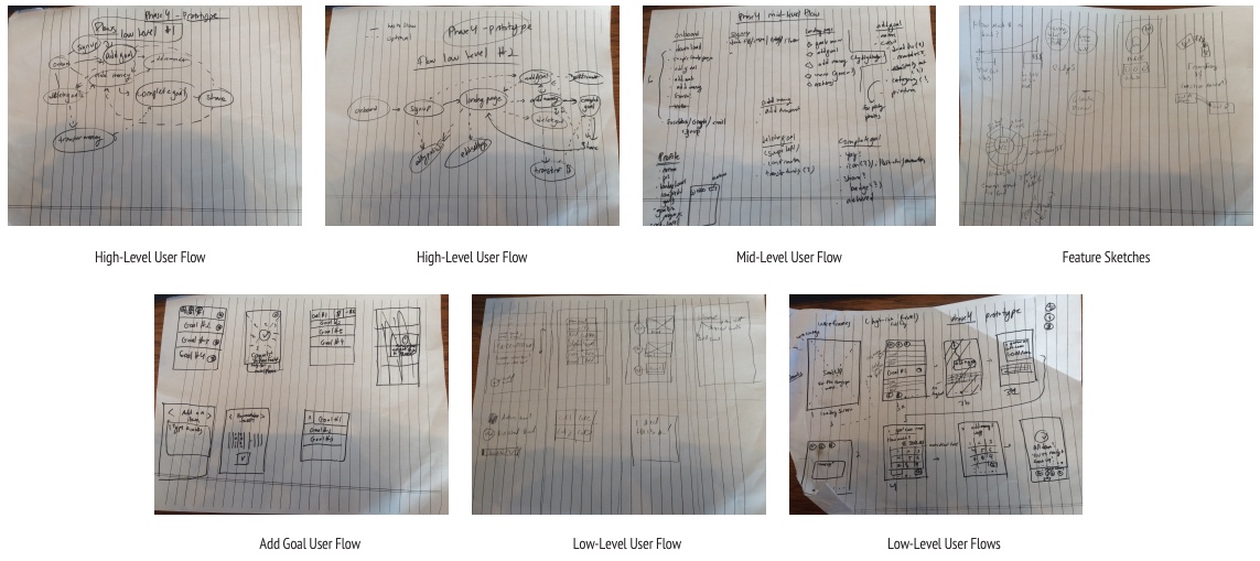
At a certain point, we hit the drawing boards, after heavily philosophizing about what consituted a neccessity or luxury item for college students.
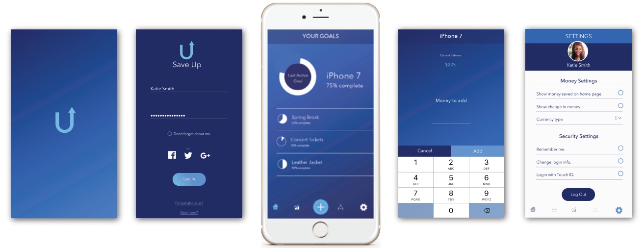
Which resulted in these beautiful sketches:
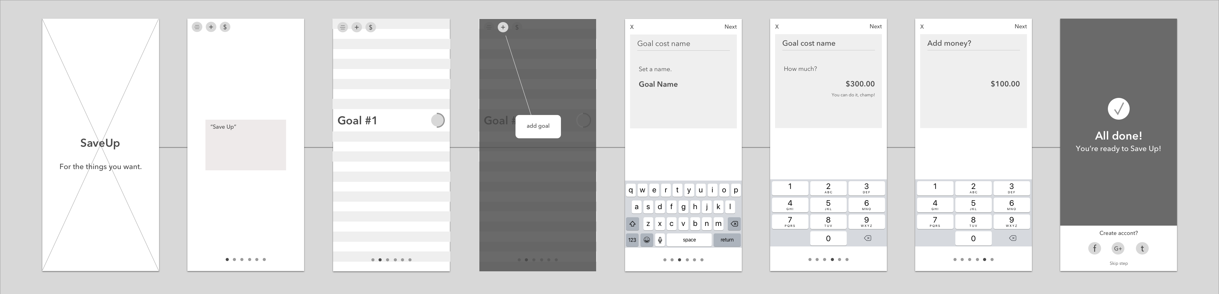
Visual Design
After much deliberation about maximizing user retention and optimizing user flows, we developed a minimalistic design language and UI.
Invision prototypes and user testing materials can be given upon request.
User Testing
IIn short, millenials aren't all tech wizards.
The best way to ruin a beautiful theory is with a little user testing.
We went into this project expecting to do a short design sprint on a personal project as a proof-of-concept for gamifying money-saving for millenials. We discovered we had found an untapped need for money-trackng in the millienial age bracket. Over and over, we were told, "I could really use an app like this," "I already do this in my head, but I could really use an app to track it."
This is when Alex and I decided that this app should go to market, and it was worth revising until it was app-store ready.
Along with the exciting realization that we had the potential for a real, viable product, came the pitfalls. We had a wealth of those.
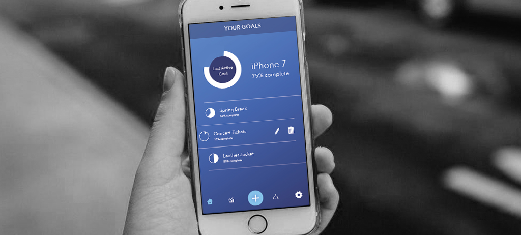
We used conventional right-left swipe gestures of mail applications to give users an easy way to add money to a goal or delete/edit it. We were wrong.
Only our power users knew to try those gestures. About half of our testing pool didn't figure out those gestures until after the testing period was over.
One very frustrated user, when asked if he would use the app in the future, said, "No! I don't know what it does. It's doesn't do what I expect it to do."
We found there were huge gaps in our choices of prototyping software. Turns out when people come in for user testing, they expect a fully functional prototype, full of microinteractions, and the ability to use the keyboard. InVision didn't give us this level of control, and we ran into serious brick walls with our user testing. In the future, we know to use more precise tools such as Framer, so we can test out microinterations as well as basic swipe gestures.
We knew something had to change.
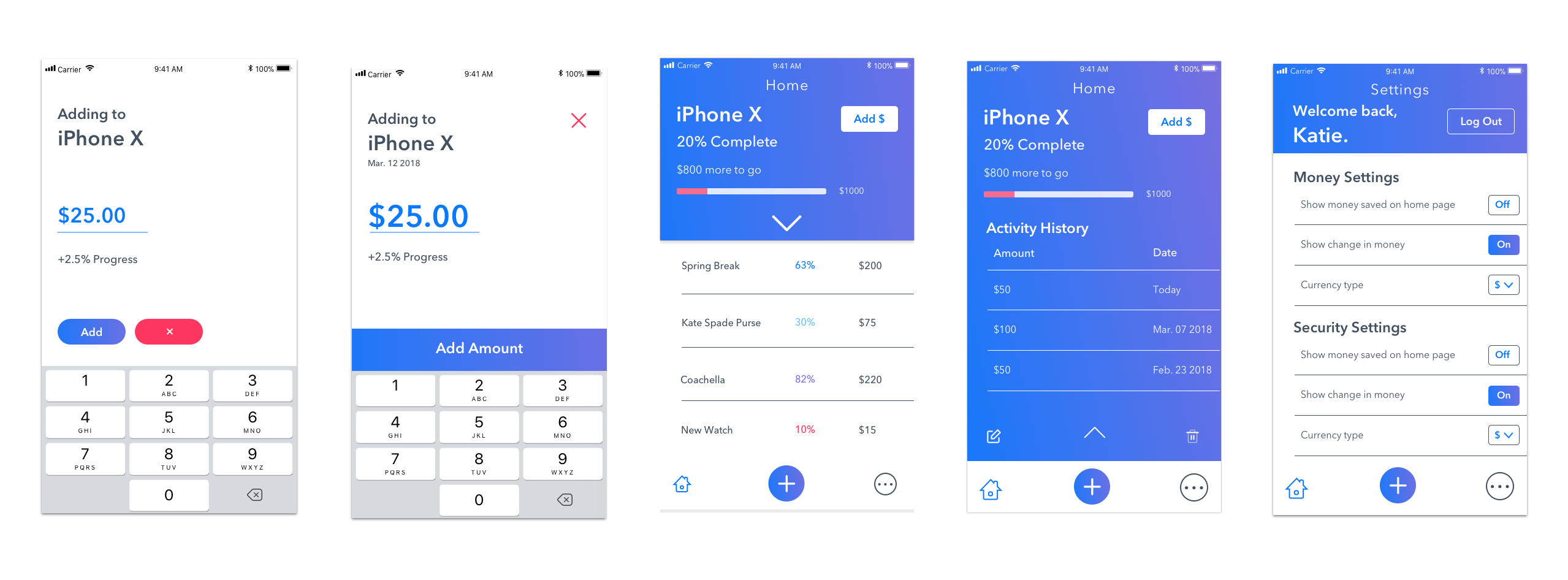
We got back to the drawing board, and realized that our visual language was too monochromatic. By adding in contrasting colors, we could more explicitly signal key things to the users such as progress, errors, and calls-to-action. We also removed some of the more confusing microinteractions such as replacing the swipe gestures with expanding menu items--a feature users kept asking for.
The result was a massive change in visual design, while maintaining most of the skeleton of our information architecture.
Development
We will be entering development in the next few months. We intend to use React Native to develop SaveUp, because of React Native's high-level performance as a non-native app framework. It is an appealing option for cross-platform development.
Future Steps
Post development, we hope to go live later in 2018 on the App store, with eventual plans to develop more features and an Android App.