Do you speak Bernini? Creating Identify3D’s new design language
When I joined Identify3D in May 2017, they had a suite of three products that were being built by three different engineers, and no designer. They needed a designer to build a design language to unify their product suite. By creating a design system, this gave members of the product team the ability to translate the product into one with an intentional UX, intuitive architecture, and carefully curated user flows.
TL;DR
To summarize the summary of the summary:
Identify3D needed a designer to come in, learn about the company, its technologically complex product suite, and create a design system that would unify and represent the company and its products. I did that over the course of 3 months. Later on, I found out the design system needed some serious tweaks. Slow and steady wins the race.
Role: UX/UI Designer
Tools Used: Sketch, Pen and Paper, Adobe Illustrator, InVision, HTML/CSS, Bootstrap Customizer
The Problem
3 products + 10 engineers + 0 designer + 3 UIs = Confusing UX.
Before I came in, product flows were explained during demos and independent user operation required a dense user guide. Identify3D brought me in to develop a design language that would unify their three products and make the complicated user flows accessible and available for public launch.
How do we create a design system that unifies three very different products and works for a highly diverse user pool?
User Research
What do design engineers, IT professionals, and machinists have in common? Not a lot.
Identify3D’s three products, Protect, Manage, and Enforce sew the digital thread together. (In other words, we’re talking about CAD designers, CNC machines, and 3D Printers.) Our product suite serves as a secure handoff between our three major players in the world of digital manufacturing. The people handling the different parts of the thread vary dramatically in technical skills, complexity of programs they use professionally, their pain points, and knowledge base.
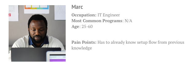
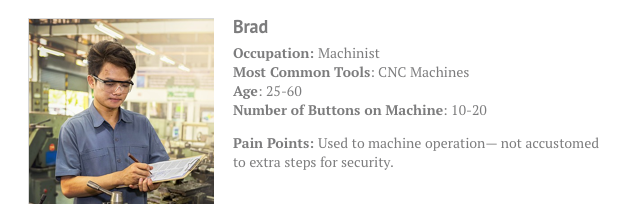
Meet the Andrew, Marc, and Brad.
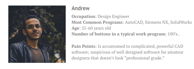
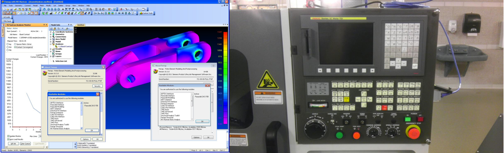
Siemens NX, pictured left. This is the kind of software Andrew uses. CNC machine interface, pictured right. This is the kind of interface Brad uses.
So, how do we design for these guys? Don’t reinvent the wheel. Then add some custom-made spokes.
As this was my first time ever building a heavy-duty design system, I set out to learn what the big league players did. I learned from companies such as IBM Design, Apple iOS, and AirBnb.
Here’s what I learned from the big industry players: no one does it the same way. Commence the mixing and matching.
Here were my takeaways from AirBnb’s process:
- Establish guiding principles for individual designs that are unified, universal, iconic, and conversational.
- “A unified design language shouldn’t be just a set of static rules and individual atoms; it should be an evolving ecosystem.
- Emphasis on well-defined and reusable components
Here were my takeaways from IBM Design’s process:
- Invite users in and show them what they can do.
- “Forgiving environment where mistakes can be easily fixed."
- Organization schemes (LATCH): location, alphanumeric, time, category, and hierarchy.
Here were my takeaways from Apple iOS’s process:
- Key new elements: flat backgrounds, minimalist typefaces, bold highlight color, soft blurs.
- Thinking with layers: opacity can indicate different environments within a screen.
- Button size: minimum tappable area of 44x44pt for all controls
So I (largely) modeled my process after AirBnb’s design language hackathon method.
Their process came down to establishing company values, translating those values into design values, key phrases. The next part involved building more than just assets like buttons, typography, headers, and color schemes. They built molecular, contextual structures out of those assets to give designers a strong yet precise foundation of how to build out new features across a large product and team, while maintaining AirBnb’s design sensibility consistently across their web and mobile apps.
Design Exploration
“Design has always been largely about systems, and how to create products in a scalable and repeatable way”— Karri Saarinen, AirBnB
I dove in by taking a quick survey across the office about design values— everyone from product managers, to our product marketer, to our CEO.
“We have to protect from the bad guys, but not prevent the good guys.” — Joe Inkenbrandt, CEO
“Each one of our products is on one spot of the continuum, and we need to convince users along the continuum.” — Randy Franklin, PM
“[Users seek p]eace of mind, security, repeatability, ‘trusted advisor.’” — Tim Rose, Product Marketing Manager.
So, here’s what I learned about our company values:
In short, Identify3D values Modularity, Seamlessness (blending), Consistency, and Stoicism.
After learning more about our users and their needs, it became clear that the users need two clear things out of Identify3D’s experience and design:
- Timeless, classic design— it’s important to stay away from trendy design, because users are used to using older software that doesn’t change a lot. User confidence will be stronger if we mostly stay away from trendy design.
- Gradual progression-- we’re operating in a continually changing field, and one of our goals is to help the various users transition from old school manufacturing practices into the digital space and beyond.
Visual Design, and Revisions, Revisions, Revisions
So I created a design system, and redid the whole thing 6 months later.
Over three months, I learned about Identify3D’s products in more depth, and through a combination of feature development in the current UI and creating the design system, I developed a design system. To honor the company value of seamlessness, I chose a limited, subtle color palette. In the name of accessbility, I chose a color palette that would be effective for color-blind users. I picked system native fonts that would automatically load on PCs and Macs. By August 2017, Bernini was presented for approval.
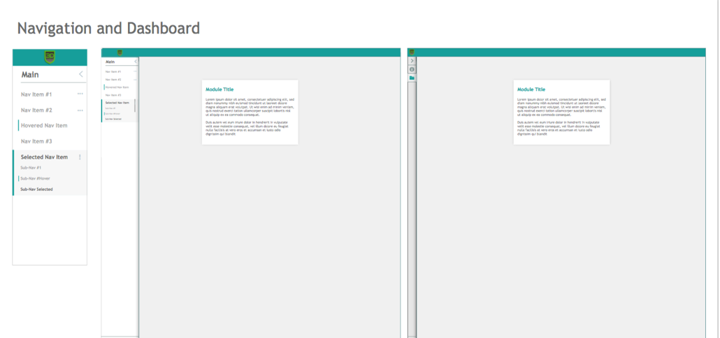
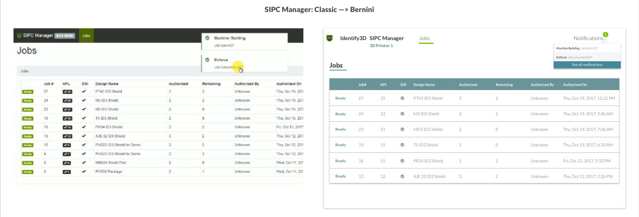
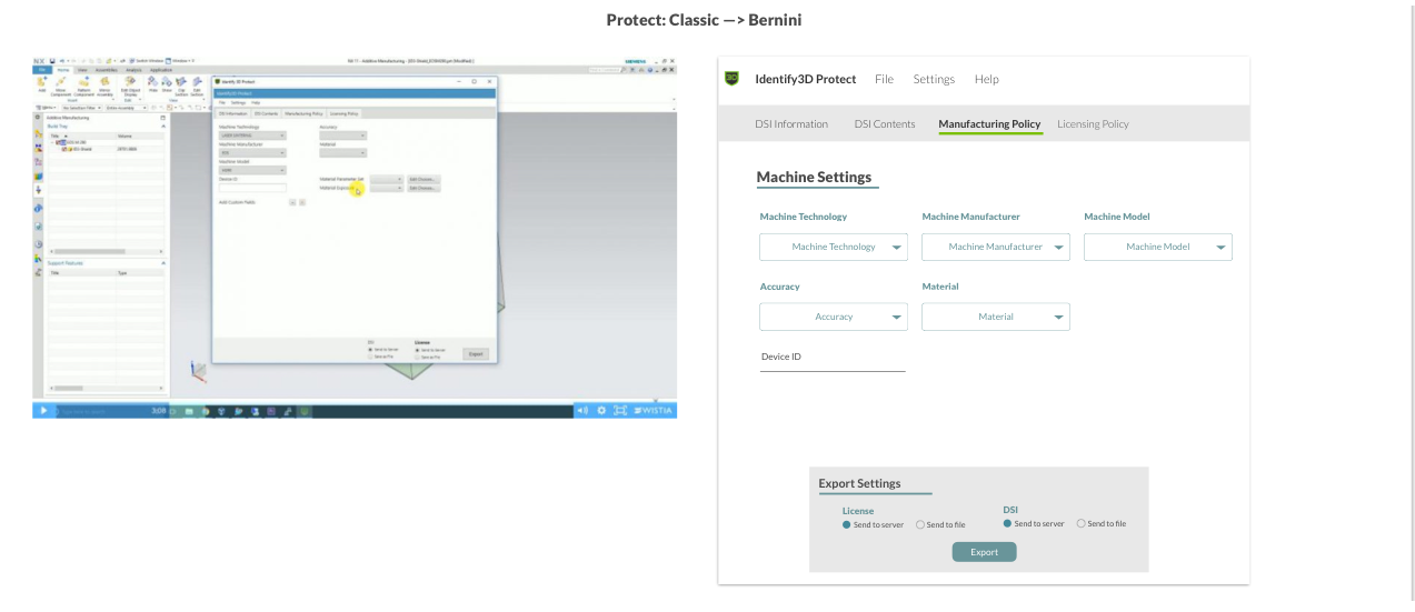
Six months ago, I reviewed Bernini (named after the famous Renaisance-Era Italian Architect), and realized that Bernini’s first rendition was too complicated, and too startkly different to Identify3D’s products current aesthetic to be able to integrate it gradually and seamlessly. As I started to build new features, blending our “classic” design patterns with Bernini, (referred to as Clanini), i saw a subtler yet, more seamless Bernini start to emerge.
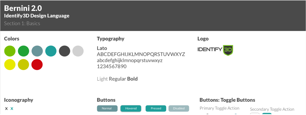
Bernini 2.0 was on its way.
After careful review, I realized I needed a more modular, contextually dependent model. Bernini is designed for complex interfaces with continually changing, ever increasing feature additions. If Bernini is going to be simple for designers and developers, contextual instuctions, bigger puzzle pieces, would be needed.
So, as I (slowly) developed new features, I would utilize this knowledge to develop Bernini 2.0, and due to Bernini 2.0’s more simple UI, subtler interactivity, and largely context-dependent elements, I have been able to slowly integrate the information architecture of Bernini 2.0 into our existing product.
Development
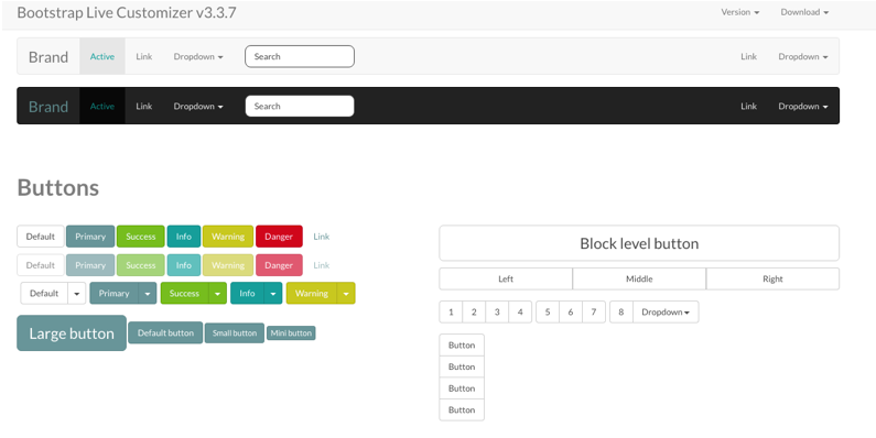
It begins with a Bootstrap Customizer.
After much deliberating with our frontend developer, we realized that to full employ Bernini into our products is going to take more resources than we currently had. He recommended Bootstrap Live Customizer as a painless and simpler way to integrate Bernini-like elements into our current product with ease from a development angle.
Future Steps
The goal is to eventually deploy Bernini into all of our products, and unify Identify3D’s product suite for engineers, IT engineers, and machinists alike, and make their experience all the easier and more seamless.